
Professional design is good not by itself but only when it meets the objectives of the site. It should not so much attract as hold the attention of the correct user. People will ignore a design that ignores people. In this article, we give examples of website design and discuss the latest trends in the field.
Design tips for a successful website
1. Strategy
No matter how beautiful the site, if the user does not understand its purpose, he will admire and leave and never bought anything. Therefore, the design should tell the visitor where he got, what can be done here and why it is worth lingering.
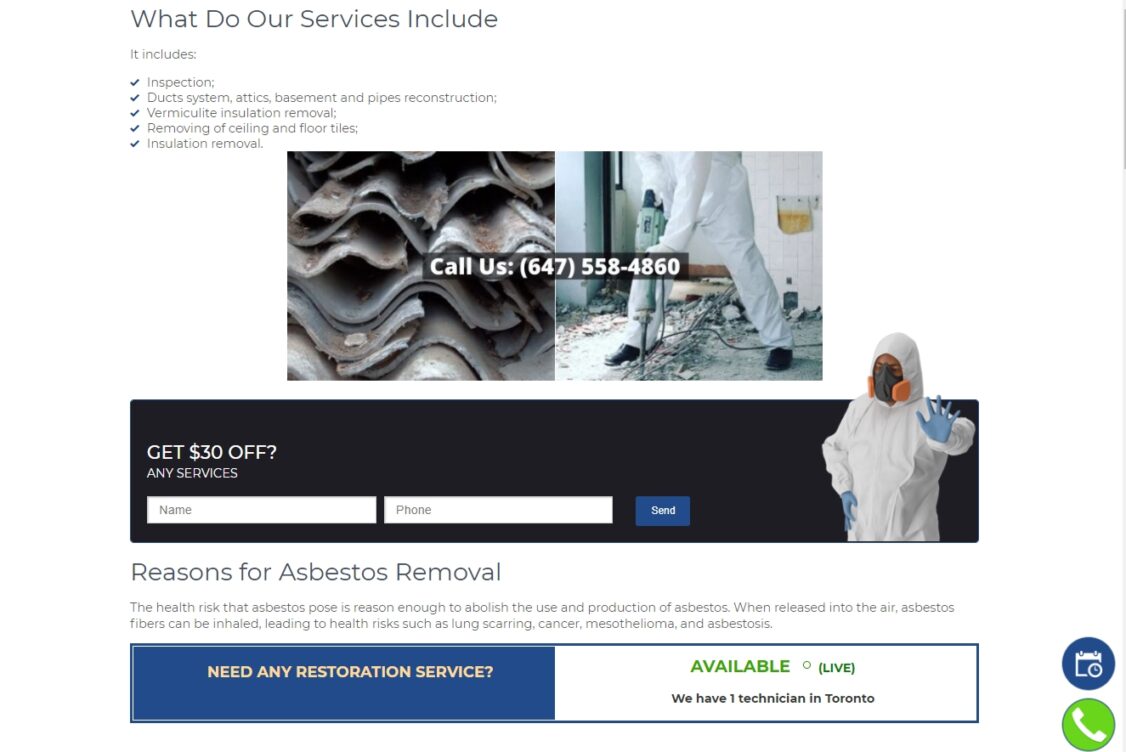
For example, here is the site of Guru Restoration, the premier asbestos abatement company:
It features photos of services and uses professional colors that are associated with a severe company. It is immediately apparent to the visitor what kind of service they are being offered.
2. Usability.
Usability covers a lot of parameters, from download speed to ease of navigation and search. We have already written about the principles of web user interface design, but here’s a summary:
- Know your user level (a site with which you can build mathematical models will be very different in interface from an online clothing store).
- Use models you already know (if the user doesn’t understand how to use the site menu, they are unlikely to take the time to use the content).
- Create a visual hierarchy (show the user what’s essential and separate blocks of text to make browsing easier).
- Keep it simple (if something can be made even simpler, do it).
- For example, Wunderlist uses icons and principles that users are familiar with from email (drag-and-drop to-do lists, inbox, chat) and office applications and calendars (alerts, sorting) and the standard paper list crossing off completed to-dos.
3. Style availability.
A good website is consistent with the company’s existing marketing materials, corporate colors, and values. At the same time, it observes the laws of composition. It reasonably uses more straightforward brings out the right feelings in the user – reliability, joy, confidence, compassion – depending on the company’s goals.
For example, the site of coffee shops often uses the corporate shade of green and black – the color of the main drink, which is sold in all countries of the world.
4. Content quality.
It consists of two indicators: readability of usefulness. If helpful content is unreadable, the user will never know how valuable it was. At the same time, uninteresting content that is not useful will not save even the best design.
5. Can I trust this site?
A corporate website, which lists only an email address as a means of communication, causes distrust among users. Blogs that don’t know anything about their authors seem unreliable. Stores that don’t tell anything about payment and delivery methods don’t get orders. So check:
- Is it clear who owns the site?
- Is the company logo visible?
- Is the detailed contact information provided? Mailing address, driving directions, office hours, phone numbers, email address
- Is there a section on the site devoted to the company’s employees? The presence of such a section creates a feeling of having already been acquainted.
- Does the site have customer reviews and portfolios?
- What is known about the company’s history? How long has it existed? Who is the founder? Who are the investors? What are the company’s goals?
- Is there information about warranty returns and service? Terms of use and privacy policy?
The latest trends in website design
In addition to complying with the above requirements, it is worth considering current web design trends and using those applicable in a particular case. What’s popular right now?
Adaptability
If previously only PCs and laptops were used to access the Internet, there are many more devices with screens of different sizes: smartphones, tablets, and wearable devices. For users of these devices was comfortable browsing the site, it is worth thinking about adaptive layout.
Flat design
Flat design will retain its position since it focuses on the end-user. It is characterized by simplicity, lack of redundant effects, and straightforward typography.
Use of animation and video
Background videos and animations are used to make the site more lively and interactive.
The proliferation of UI patterns
With the advent of single-page web applications, websites are becoming more unified. Numerous web design examples show the widespread use of hamburger menus, short registration forms, logins using social media accounts, long scrolling, and others.